
How to cover a design event on social media without blending into the noise
You walk into a design fair or trade show, You’re full of energy. The space is buzzing. The stands are looking strong. Your phone battery is fully charged. You snap away and post on Instagram, only when you open up Instagram, you soon realise that everyone else in your sphere is also posting about exactly the same things.
You see the same standout stands. Almost identical angles. Not dissimilar captions. And often posted within minutes of each other.
It’s not that it’s bad content. Most of it is well-shot (or as well-shot as exhibition hall lighting allows for), thoughtful enough and largely aesthetically pleasing (it is the design industry after all). But very little of it feels distinct. And that swiftly turns it into noise that is all too easy to swipe past.
And there lies the challenge with covering industry events on social media, especially at the start of the year when the design calendar is dense and everyone is looking at the same references at the same time.
Between Maison&Objet in January, Surface Design Show and Stockholm Furniture Fair in February, Salone in April and other international fairs setting the tone for the year ahead, feeds quickly fill up with interchangeable content.
It’s not that access is an issue - you all have the ability to view the same thing and you’re all going to the same shows. It’s simply about the approach you take with it. So how do you tackle it to stand out from the crowd?
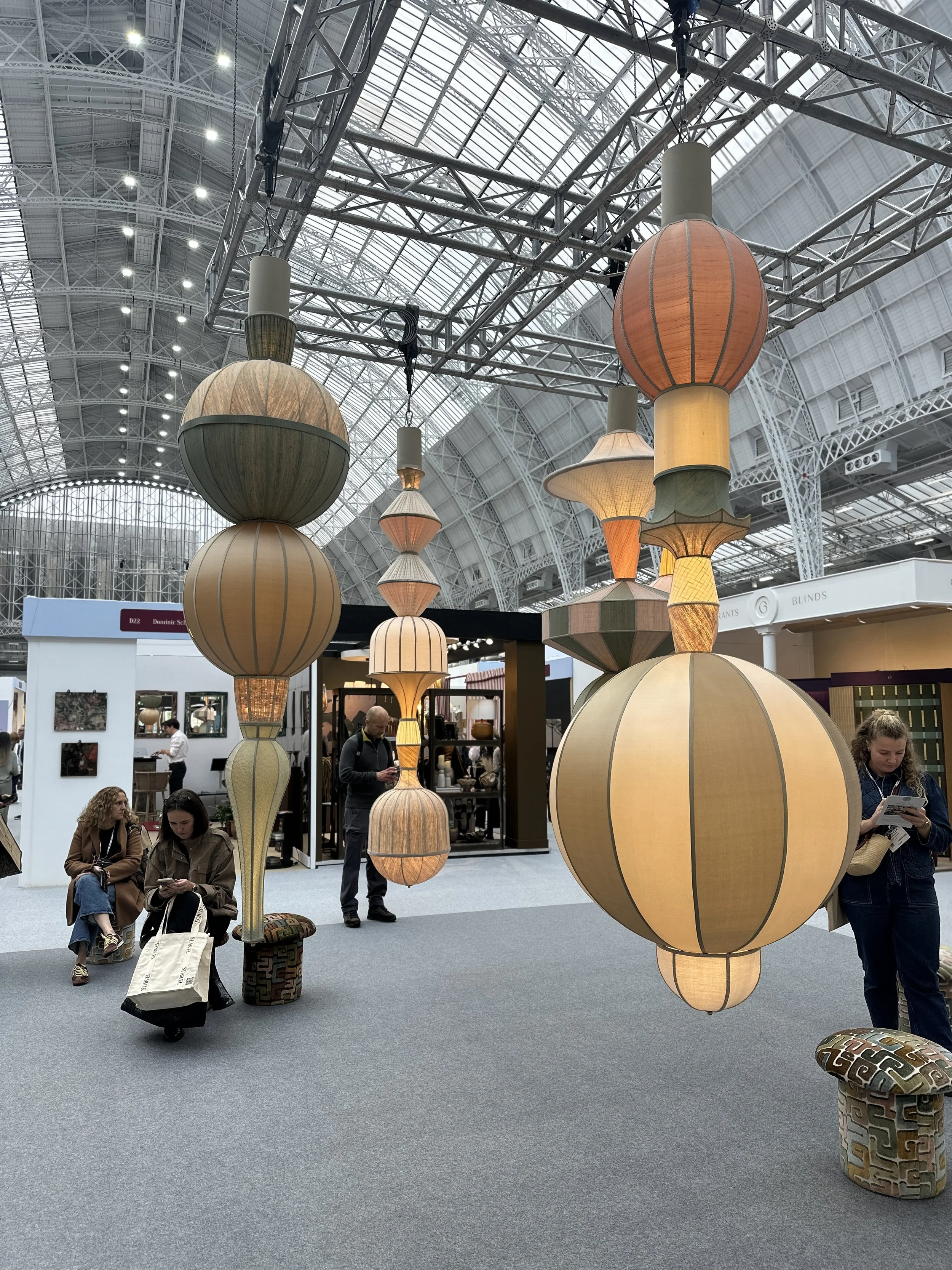
A photo from the entrance at the 2025 Decorex show at Kensington Olympia
START WITH MINDSET, NOT A SHOT LIST
Most event coverage falls down simply because it focuses too heavily on the logistics. Which halls are you going to cover? Which brands are you going to visit? How many posts do you want to get out of this show? Focusing on these things will almost always lead to volume over value.
Instead of thinking like reporters where you’re documenting everything in sight, we encourage you to approach event more like an editor. Before anyone arrives, the most important work is agreeing how you’re going to look at the show. Rather than asking: “what should we capture?”, ask: “what are we trying to understand?”. That might be what trends are emerging, what patterns can you spot, what’s new and standing out?, what’s feeling overdone?
Thinking this way is subtle, but it fundamentally changes how you move through a show. When you’re too focused on capturing, your brain goes into collection mode. You’re reacting to what’s in front of you, ticking things off, grabbing images because they’re there. It results in a lot of content, but often very little clarity to answer so what?
When you’re focused on understanding what you’re seeing, you start filtering instinctively. You pay attention to what’s being said loudly, and what’s being said quietly. You start asking yourself questions as you go:
What feels genuinely new here — and what feels like a continuation?
What’s being repeated across multiple stands, materials or forms?
Where does the work feel confident and resolved, and where does it feel uncertain?
What’s being pushed forward, and what feels like it’s being left behind?
This way of thinking naturally slows you down (this is a good thing). It gives you permission not to photograph everything. It helps you trust your judgement rather than your camera roll. But most importantly, it shifts the role of social content from documentation to interpretation, which adds more value to your followers.
Instead of saying “Here’s what was there”, you’re able to say “Here’s what we noticed — and why it matters.”
That’s the difference between content that fills a feed for a few days, and content that actually positions a brand, studio or platform as thoughtful, editorial and worth listening to.
And once that question is clear — what are we trying to understand? — every decision that follows becomes easier: what to shoot, what to ignore, what to write about, and what to leave unsaid.
Think like an editor, not a reporter
Remember that a reporter asks: what’s here?, whereas an editor will ask “what matters?”. Editorial thinking means holding a few loose lenses in mind as you walk the floor — not rigid trends or predictions, but ways of seeing that help you edit in real time.
You might find yourself noticing:
A shift towards calm or a swing back to maximalism
Moments of restraint versus excess
A renewed emphasis on material tactility
Colour being used to create mood rather than follow fashion
Signs of genuine evolution alongside repetition and familiar ideas
These lenses give you permission to ignore work that doesn’t contribute to a bigger narrative — even when it’s beautiful. And that restraint is what separates considered coverage from visual noise.
Fewer images, more intention
One of the biggest shifts when you start thinking editorially is how you use your camera.
Strong event coverage isn’t about how many images you come away with — it’s about how deliberate those images are.
Instead of trying to capture everything, focus on:
Details over wide stand shots
Textures, finishes, joins and material pairings
Moments where materials meet or contrast
Atmosphere rather than catalogue-style documentation
Wide shots have their place, but they rarely say much on their own. A close-up of a surface, a subtle colour relationship, or the way a material is handled often communicates far more about where design thinking is heading.
A useful rule of thumb: if an image doesn’t spark a thought, raise a question or support one of your themes, it probably doesn’t need capturing.
Restraint isn’t a limitation here — it’s a signal of clarity and confidence.
People, not just products
Design fairs might be object-led, but they’re ultimately social spaces. Some of the most compelling content doesn’t come from the most polished stands, but from the moments in between:
Designers explaining their thinking
Makers talking through process
Conversations sparked by curiosity or disagreement
Quiet pauses between appointments
These human moments add warmth and credibility. They show engagement rather than surface-level attendance, and they give your audience a sense of access — that you weren’t just passing through, but really paying attention. If you’re speaking to someone interesting on a stand, ask if they’d be open to being filmed for content - many will say no, but you don’t need everyone to do it!
Even subtle, un-staged moments can lift content instantly and stop it feeling transactional.
what most people do vs what actually works
Most event content follows the same pattern:
Post in real time (hello 100 stories in a row)
Move stand by stand
Share what was seen
It’s understandable — but it’s the reason why so much of it just blends together.
What tends to resonate more is the opposite approach:
Reflecting rather than reacting
Grouping content around ideas, not locations
Leading with commentary instead of listings
This doesn’t mean never posting during a show. It just means being selective about what earns that immediacy — and what benefits from a bit of distance and perspective.
edit for longevity, not immediacy
Very little needs to actually go out straight away.
Some of the strongest event content is created after you’ve had time to step back and join the dots:
A considered post once impressions have settled
Themed carousels exploring a single idea
Longer-form commentary that pulls patterns together
The goal isn’t to shout “we were there”. It’s to articulate what it all meant.
When you capture with longevity in mind, events stop being fleeting moments and start becoming useful reference points — for your audience and for your own thinking
A practical example: maison&objet
set the scene beyond the exhibition halls
Some of the strongest content comes from setting the scene around the fair, not just inside it:
The mood of Paris in January
Where designers are eating, meeting and decompressing
The contrast between the scale of the halls and the intimacy of the city
Quiet moments between appointments
This “while you’re in town” layer instantly elevates content beyond the walls of the exhibition itself. It adds atmosphere, perspective and a sense of place — and stops everything feeling like it was shot under the same ceiling lights.
think in themes, not territories
The show itself is simply too big to tackle brand by brand, stand by stand. Instead, agree three or four themes — or things to look out for — that you and your team work towards.
These might be emotional, material-led or conceptual, but crucially, they act as a framework for deciding what to stop for, what to photograph, and just as importantly, what to walk past.
If something doesn’t ladder back to one of those themes, it’s probably not worth capturing.
This approach reduces overwhelm and creates coherence when content is edited together later — turning a vast, visually noisy show into a clear, considered narrative.
capture reflections as you go
If you’re attending as a pair or a team, don’t just split halls — split thinking.
One person might focus on materials and detail, another on atmosphere and people and another on colour, form or broader patterns.
This avoids duplication and ensures you’re collectively building a layered view of the show, rather than competing for the same shots.
Some of the most valuable insights don’t live inside your camera roll.
We always recommend capturing thoughts alongside visuals:
Quick voice notes
End-of-day debriefs
Swapping impressions and challenging each other’s takes
What feels exciting to one person might feel tired to another and that tension is often where the most interesting commentary sits.
This also ensures nothing gets missed, especially at a show as expansive as Maison&Objet.