
5 of the Best Creative Inspirations in 2021
Our Inner Circle Member, Ben runs us through his top best creative inspirations of 2021. From TV to colour palettes, and even a shock revelation at the end, read more to see which creative designs have caught his eye in 2021.

The NASA Worm Returns
The famous NASA Worm returned in 2021, in the year the designer Bruce Blackburn sadly died, the logo took another journey into space. The Worm originally adopted by NASA in 1974 was retired in 1992, and replaced by the also lovely ‘Meatball’ logo, but this year in May, I along with lots of probably quite nerdy designers were very happy to see the SpaceX Falcon 9 was adorned in the iconic wavy logo soaring through the atmosphere.
Bruce got to see his logo reprised before he died this year and his daughter is quoted as saying “I think he was glad to know that his design was finally back in space”.
It’s a gloriously simple piece of design, a perfect word mark, a retro-futurist classic, and something that you’d want to be representing us all in space should aliens ever catch sight of it.
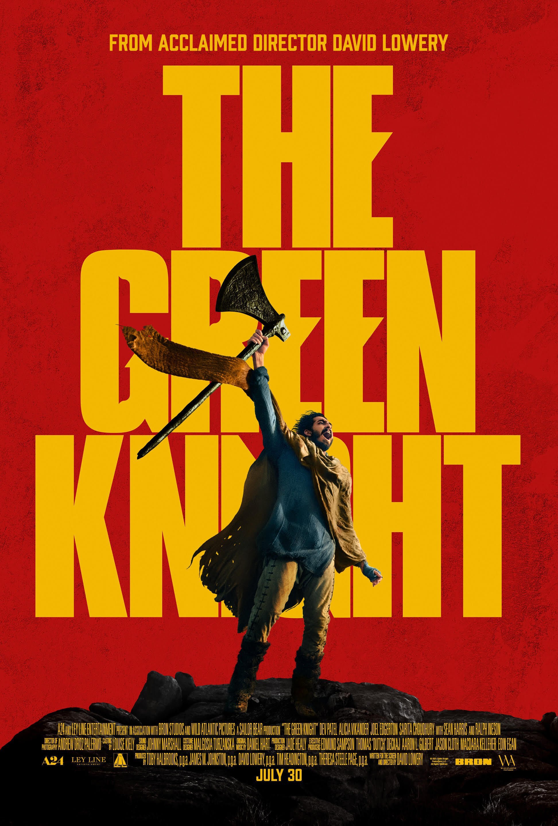
Green Knight Posters
The posters for David Lowery’s Arthurian legend adventure were a triumph, but imagine not making this poster green! When it was released, Twitter simply couldn’t believe it.
This colourway is a great example of rejecting your first idea and not listening to the most obvious feedback from the smallest minds in the room. The confidence to ignore the inevitable ‘but it’s not green’ is a triumph and inspiration, it’s how great work gets done.
Design critique has become people looking for the most logical, water-tight reasons to make arbitrary changes to something to prove their value to the process, and this always rejects the creativity and energy with which good art is created. Sometimes saying nothing is as valid as making the logo 5% bigger.
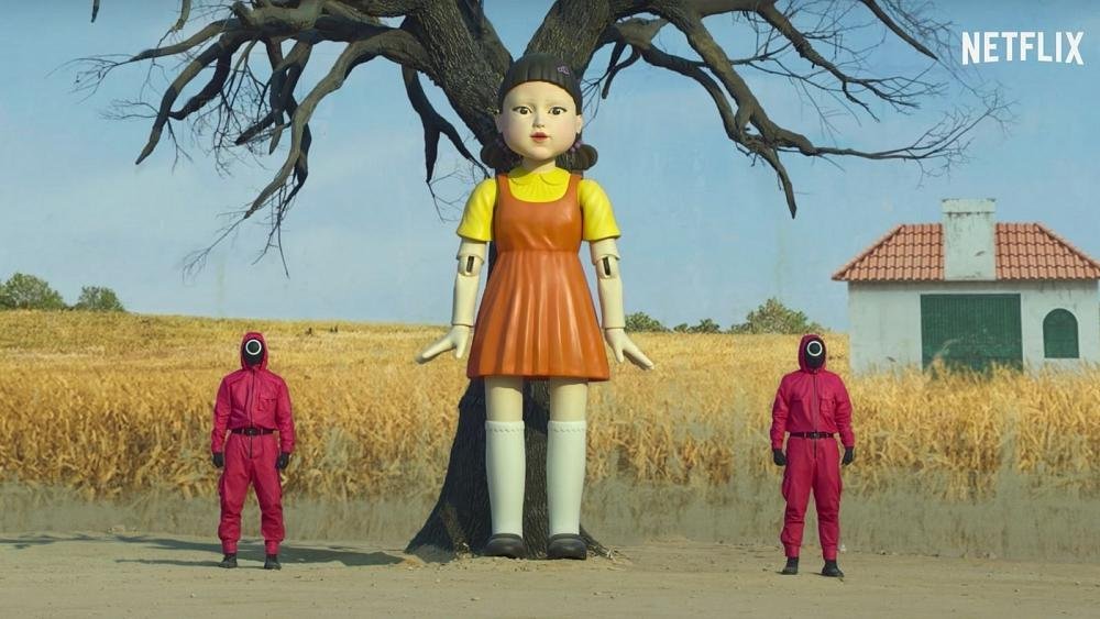
Squid Game
You can tell how deep an influence a piece of art is going to have on culture by how quickly it turns into a Halloween costume, and this year dressing as a guard was deemed scary enough for trick or treating.
Squid Game is Netflix’s most popular series, seen by everyone except my wife and pretty much universally loved for its strange, unsettling themes and dark twisted anti-capitalist storyline. The way the show looked was so utterly modern it could only have been made in these weird times. Stark, simple iconography, unnervingly playful pastel colours, and brutal neo-futurism made the whole experience visually rewarding and as iconic as the storylines.
When a show captures the imagination like Squid Game it’s because every single detail is on-brand, everything from the contestant’s shoes, to the sounds of the scoreboard, is coming from the same creative place. You can’t sit down and work things out like that it has to flow from you in a creative stupor, this show radiated that creative energy.

The Colour Yellow (with a hint of magenta)
Phone cases, pencils, notebooks, water bottles… even wine (labels, not the actual liquid, don’t drink yellow liquid!) I’ve spent 2021 semi-consciously buying anything yellow, and this has seeded itself into my design work, looking back I’ve used yellow wherever possible, perhaps it’s a reaction to the morbid news year we’ve just had, an attempt to subconsciously brighten the corners.
As a designer it’s good to lean into your phases and develop them, I like to have periods of my work that use similar fonts, techniques and colours, it’s helpful to have a ruleset in your head that you can push against and challenge, These informal restrictions can help you to think in new ways, and find new strands of creativity.
Look out for Purple next year, according to Pantone ‘Very Peri’ a soft purple lavender tone will be the one to watch in 2022, although personally I’m not ready to move on just yet.
Absolutely Nothing
As a designer, it’s really hard to write this kind of list. Real-world designers don’t play well with other designers, they’re all annoying stereotypes of one classification or another and I’m clearly no exception. Although like everyone else I consider myself secretly ‘a highly original one-off’ (with a beard and vinyl collection).
A very common feeling among my bearded, vinyl collecting designer friends is that all the designs we look at we either hate because there’s one tiny detail wrong with it, or because we wish we’d done it, so hate it even more! It frankly doesn’t leave me with a lot left to talk about.
The truth is there are thousands of good people out there doing great work that’s constantly being copied, remixed, updated, restored, and reframed, it’s an ever-changing world of ideas eating its own tail that never fails to be fascinating, and is always chasing the same creative goals.

This post was written by our Inner Circle member, Ben. If you’re in any need of brand or design advice or help, do be sure to book a 30-minute discovery call.